A friend of mine had this theory that you should never buy a book with gold writing on it, the reason being that it is merely a ploy to dress up mediocrity. I, however, like to apply the following by the late (great) Sir Terry Pratchett:
“Sometimes glass glitters more than diamonds because it has more to prove.”
― Terry Pratchett, The Truth
I design wine labels as part of my job and I find the whole label versus content conflict very interesting. I think a lot of tradiontalists still believe that good wines have old style, fancy labels and anything else is there to trick the customer into buying bad wine. Modern labels are becoming more common but they still are a bit reserved. 75% of all the labels I see at my wine shops and at work have the same back on white design and there is a hell of a lot of gold.
I say it is time to make more of design. How do you think Apple made all its money? You need to stand out. I believe in glass. It is there for you on a daily basis. You can’t drink a bottle of Kanonkop 2013 Black Label Pinotage everyday with your spaghetti bolognaise – especially not at R1350 ($112) a bottle. One of the nicest wines that I have tried lately was the Quartet 2014 Sauvignon Blanc Semillon. It costs around R70 ($6) a bottle and yes, its label has silver on it.
One won’t be wrong when they say that just because the wine has a shiny and attractive label it doesn’t make it good. The opposite is just as true. I realised this in university. I was tasked with purchasing some wine for a party and I was instructed to buy Four Cousins, which is the wine equivalent of coke but I was a poor student. Instead I went for something with a more traditional label – the kind with a coat of arms with some fancy serif type. Needless to say I never made that same mistake again, but it also didn’t mean that I still only drink Four Cousins (which does have its place in the world with its 1,5l bottles).
Here is the only thing you can do: Buy a good wine guide. South Africa has Platter’s (some feel that it is not entirely objective) and there isn’t one pretty picture in it. For fun, go out and buy a bottle from a label you know and one you don’t – choose it purely for it’s label (or out your book) and do a blind tasting. We do this at work and it is by far the most you can have with a bottle of wine and a brown paper bag. Make sure to take some notes.
So I think that we are being too hard on wines that set out to prove their worth in a very saturated market through label art. There is a lot of great wine out there with shiny and quirky labels screaming to be heard. If you want to buy a bottle of wine with a sparkly rainbow and a dancing unicorn then go for it. There is no judgement here.
Quartet Sauvignon Blanc /Semillon 2013
Tasting notes: Delicious combination of mandarin, passion fruit, green pepper, thyme and clove. Creamy texture adds depth to the fresh flavours framed by the suggestion of toasty oak.
Food pairing: Pair it with fish, shellfish and creamy pasta dishes.
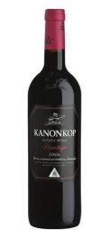 Kanonkop Black Label Pinotage
Tasting notes: A very complex wine with hints of red fruit flavours which reflects some Pinot Noir style elegance and structure.
Food pairing: Red meat or spicy Asian style dishes.

 This wine isn’t available for purchase – only from one of the many cases in my garage. It is rather special in that my cousin’s husband made it, with investment from my father and uncles. It was a very small production so it was just distributed amongst the family to which we are very proud. I had it tasted by our professional panel at work that said that it has great potential but would benefit from some longer oaking.